Purls of wisdom: how to visualise data in crochet
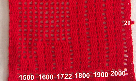
How do you make a data visualisation - and keep yourself warm? Moscow-based blogger Russian Sphinx combined both with this knitted chart showing Russia's population growth since 1500. She admits to "limited knowledge of yarns" - although she normally visualises data in slightly more conventional ways
Who made this graphic? Russian Sphinx
No comments:
Post a Comment